


In a highly competitive category with little product differentiation, packaging clearly would have to do much of the heavy lifting!
We were tasked with crafting a brand identity for Aquasure that could stand out against category leaders and legacy brands projecting a premium, unique, and stylish personality, while remaining accessible and affordable to the target consumer
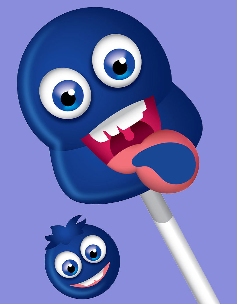
An innovative product built to put a big wide smile on a kid's face. Our packaging for Tongue Painter did what it must - heighten excitement & spread the joy wider!
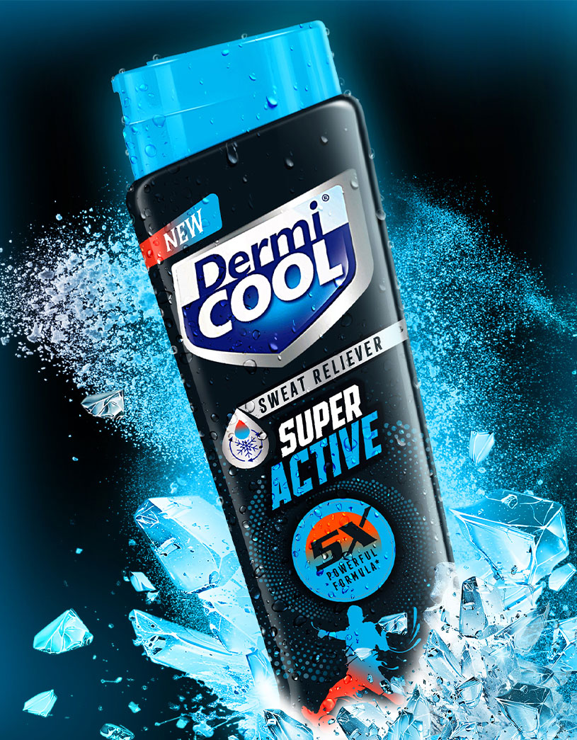
Dermi Cool Super Active Sweat Reliever - a specialist new product line extension under the Dermi Cool brand promises 5x sweat absorption & cooling experience for those who face excessive sweating, prickly heat, skin irritation, and body odour, especially during summer.
EBD designed brand packaging that focused on energetic, aspirational visuals that resonate with the primary TG - young, fitness-focused men.

A product for kids must first & foremost visually appeal to kids! Our work on crafting the brand identity & packaging for Britannia Winkin' Cow GROW did just that!
Fun, vibrant and playful vibes on packaging that aim to captivate & engage kids in the 9-14 age group while reassuring parents with clear nutritional benefits.
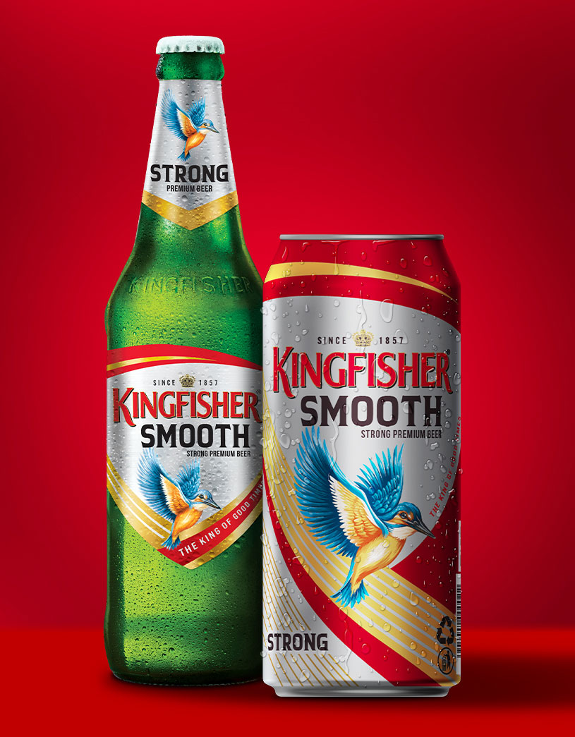
Kingfisher Strong is the leading choice in India's strong premium beer segment, embodying strength, style, and youthful fun for consumers seeking higher alcohol content (ABV).
We were tasked with crafting packaging for Kingfisher Strong's extension into a new product that distinctly emphasizes sessionability without losing the strong beer character.
The Kingfisher Smooth Strong Beer offers a more approachable flavour profile, making it both palatable and appealing to modern tastes.
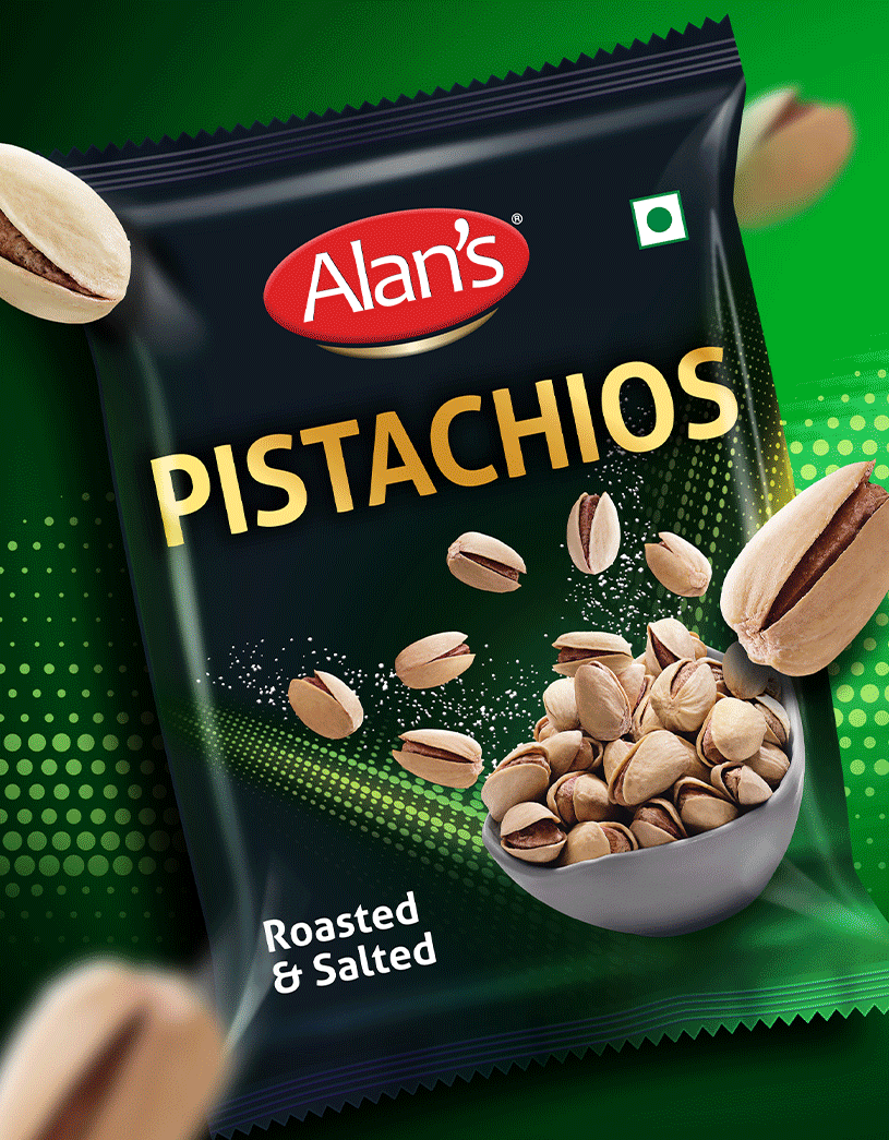
Alan's a snacking brand under Reliance Consumer Products was looking to extend into a range of rich & premium yet affordable healthy snacking.
Our packaging design for the roasted & salted dry fruits range made the products (cashews, almonds & pistachios) the hero - cueing a bold, dynamic and premium imagery that whips up excitement and urgency (to buy).
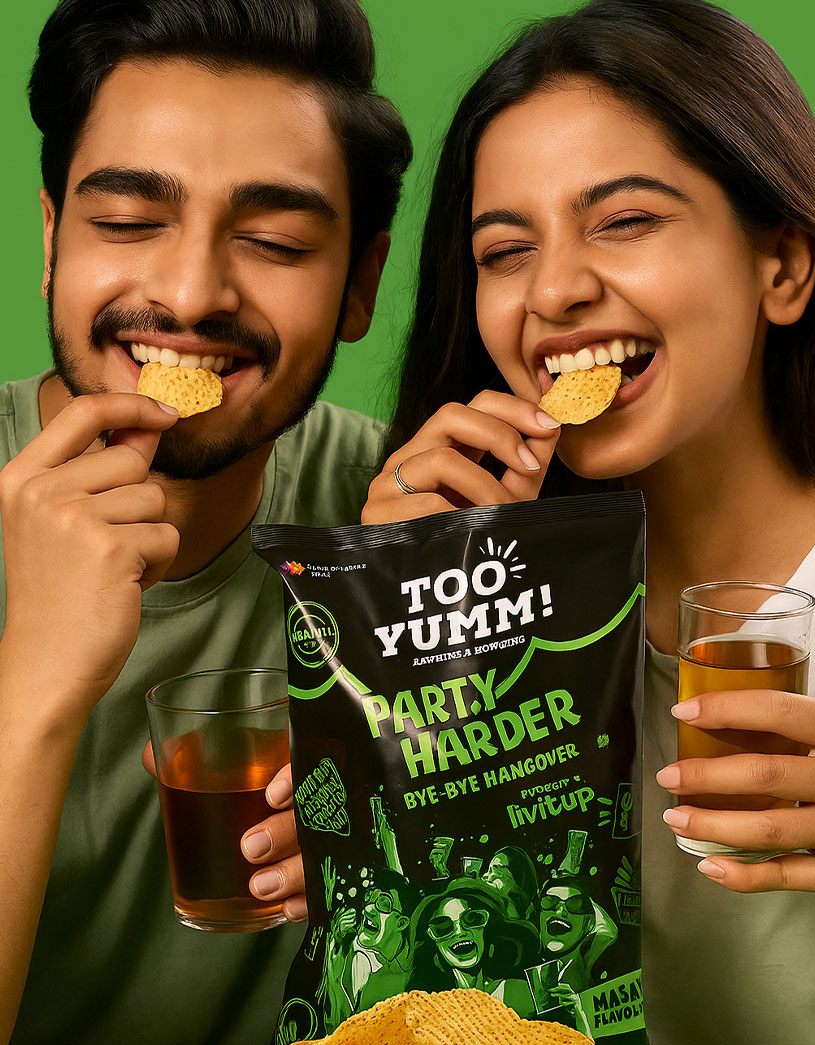
Products to prevent & cure hangovers from hard partying have existed a while. Drops, oral dissolving strips, water-soluble powders & pills...
Party Harder - a new sub-brand under the popular Too Yumm brand franchise - takes this emerging product category into bold, innovative territory.
We developed a pulsatingly cool identity & design language for this innovative new product!
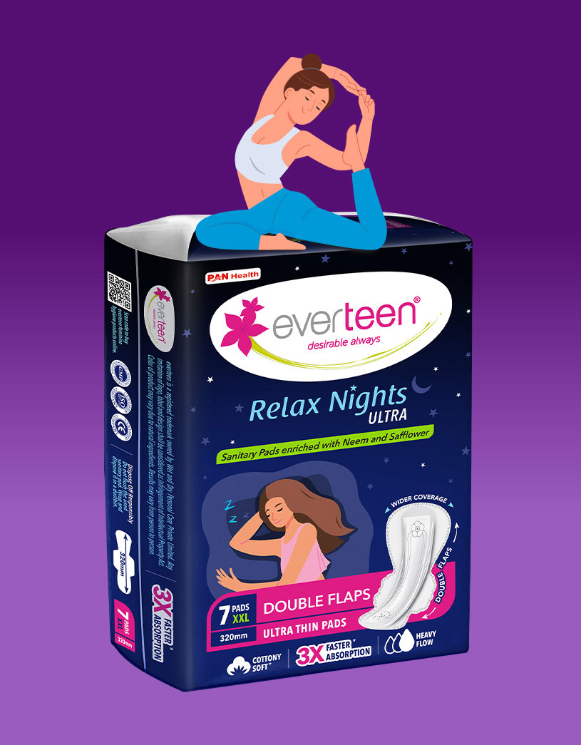
In a highly competitive sanitary pad segment led by strong brands like Whisper, Stayfree & Sofy, Everteen must stand out on retail shelves and on eComm.
We were tasked with developing a pack design language for Overnight Sanitary Pads that highlights Everteen's USPs - double flap, 3X faster absorption, neem & safflower based anti-rash properties & ultra-thin comfort.
All, while evoking trust, comfort and confidence, among young women.
We later extended the design architecture to new product variants.
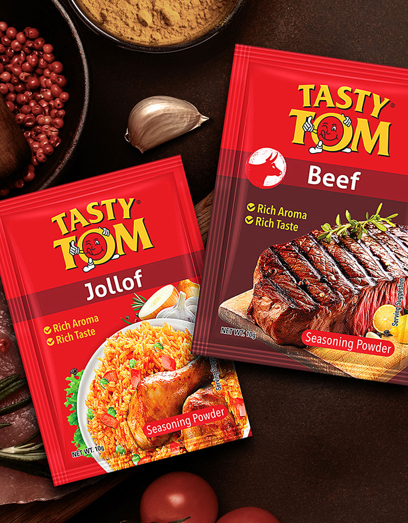
Our work for Olam Foods- Tasty Tom Seasoning Powders & Gravy Mixes involved developing a new packaging design language for a product category that inherently stands for aroma & taste.
Our design strategy focused on three objectives:
Appetizing cooked food imagery composed using high-end CGI that instantly whips up a feeling of great taste & aroma.
Clear variant colour architecture that aids intuitive product identification.
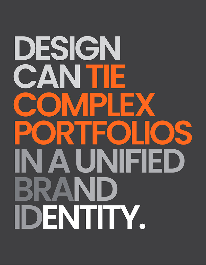
Retain established visual equities while modernizing & harmonizing the brand portfolio under a uniform identity.
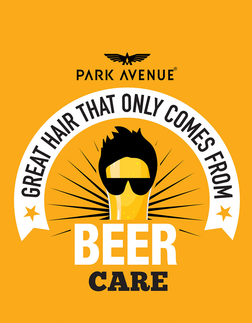
Our reimagining of Park Avenue's Beer Shampoo packaging was aimed at revitalizing & cleansing an innovative brand that had gone a bit stale.
Beyond the aesthetic uplift and harmonization of the visual identity across the range, we reworked the messaging architecture, extending the design language across a portfolio of new products & sharpened the distinction across variants.
In a market cluttered with "sameness" design that is brave and driven by surgical insights into consumer behaviour shines through. Structural innovation in a category filled with large, unwieldy, similar plastic jars.
A distinctive pack design for Fitbell Whey Protein.
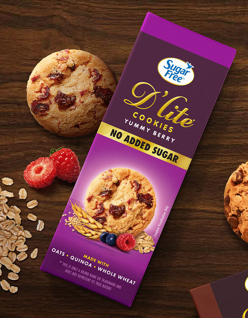
SugarFree D'lite cookies offer a guilt-free, indulgence for health-conscious consumers managing sugar intake or those seeking better-for-you snacks.
Current packaging's all-golden design while cueing premiumness, loses out on shelf throw with compromised brand name visibility.
Our task was to redesign the range packaging to achieve more impactful branding, make product imagery more appetizing, cue healthy ingredients & elevate overall clarity in on-pack messaging.
Sometimes brands realize that to bring freshness & relevance what is really needed is freshness in design thinking - one where the visual strategy is guided by the need to drive clarity in consumer messaging...
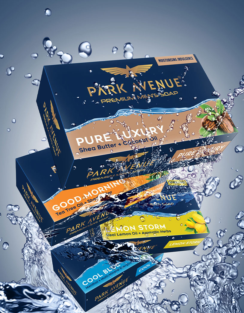
Park Avenue Soap needed a real cleansing of its packaging design.
Our work for Britannia's Winkin Cow Rich Shakes packaging delivers a premium & cool imagery that appeals to the urban youth.
The pack design captures the core product proposition (premium & exotic flavours), it's organoleptic experience and translates it into a visually appealing brand narrative that dials up indulgence.
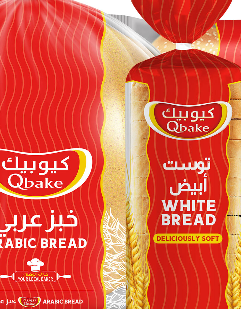
Over time, brand portfolios tend to look dated, lose identity & start to lack a consistency of messaging.
Our work for Qbake reunified a diverse portfolio and recast the brand architecture to draw clear distinctions across product categories.
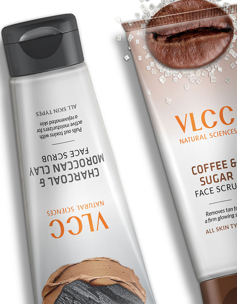
What's more "natural' than the natural ingredients made larger than life? Our design brings out the essence of this new range of VLCC Face Scrubs.
In a category marked by growing consumer inclination for natural ingredients-based formulations, VLCC's face scrubs stood out for their unique formulations based on coffee, charcoal, walnut etc.
Our packaging design strategy focused on dialing-up the promise of goodness & the product truth in a clean, bold and impactful design language that instantly grabs attention.
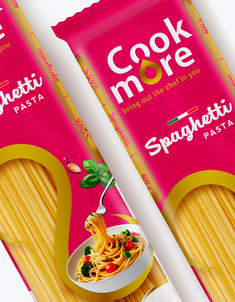
The market for pasta in Zimbabwe is divided between high commoditization and a limited set of highly expensive, imported premium brands. Cookmore Pasta aimed to bridge the gap between "premium" and affordability.
As a rapidly establishing groceries & food brand, Cookmore speaks to the homemaker who is bold and stylish, loves cooking and wants to do "more" for her family everyday.
Our pack design language carried forward the premium Cookmore identity while the distinctive window showcasing the product reinforces the "made from the best quality wheat" message.
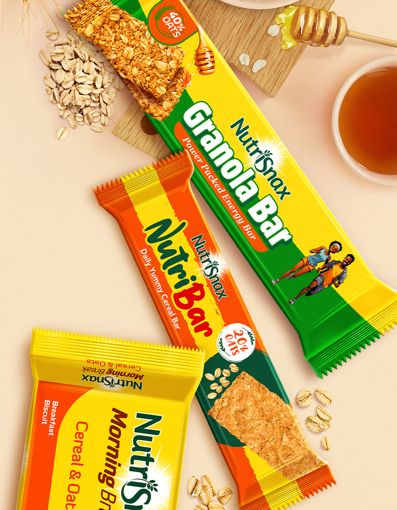
NutriSnax Breakfast Cereal Biscuit is a convenient, energizing snack made from whole-grain ingredients targeting health-conscious adults and on-the-go consumers.
Our challenge was to differentiate NutriSnax from established brands such as Belvita with a design that is premium yet approachable.
We leveraged NutriSnax's established equity while creating a distinctive design that clearly communicates its new "Breakfast Biscuit" proposition. The design language was then extended seamlessly into new cereals & granola-based product line extensions.
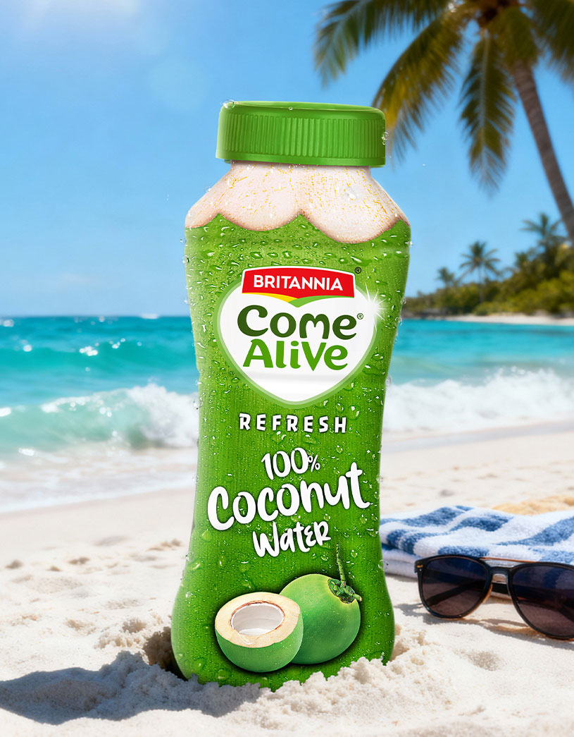
A unique product line extension under Britannia's Come Alive brand portfolio, ComeAlive Refresh 100% Coconut Water is a new entrant in the category dominated by established brands such as Dabur Real, Storia, Paperboat and Cocojal.
We dialed-up the "100% Coconut Water" theme with a pack design that mimics an actual tender coconut ready to be served!
The clutter-breaking design leaves consumers in no doubt on what to expect - a delicious way to rehydrate and rejuvenate. Britannia's equity does the rest to build consumer trust in the product.